Thinking or experiencing some sort of “emptiness” whether it presents itself in a form of an absence of thoughts, emotions, shapes, content or thoughts, signifies a deep lack of an essential component that together with emptiness constitutes wholeness.
An understanding of “white” as a color is more of a sensual experience, a phenomenon that presents its quality is a simple visual form that arises from within our sensitivity to light, shade, and color.
“White” is not a tangible individual thing that exists on its own, it is limited to a perception of its quality, a way of feeling its presence. In Japanese culture, whiteness is associated with emptiness, cleanness, and creativity. Its’ being can be sensed in many daily rituals such as the teas ceremony or communication, arts of both are associated with the level of absence of noise, chaos, unnecessary details, and cherished by the level of appreciation of emptiness.
Kenya Hara expresses its’ understanding of “white” heavily rooted in the cultural heritage of his homeland of Japan where tea making, the importance of space, and respect towards indirect forms of communication collectives shaped his design path. Being a graphic designer himself as well as a professor at the Musashino Art University Hara’s interests oscillate around designing solutions and translations of circumstances and conditions not things and products.
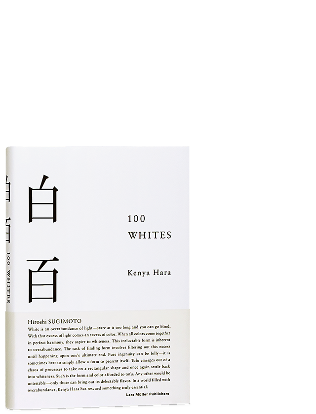
“White” by Hara is an aesthetic combination of thoughtful concepts, cultural drops of inspirations, and an interestingly simple form that takes shape of a small 77-pager booklet that contains nothing more than pure artistry of verbal translation of visual mark of the color “white”.
Combined in four chapters, this piece of white and black paper expression is decorated in a modest amount of illustrations but a rich level of verbal artistry is the must-read for any design enthusiast as well as a colorist or an art therapist.